Letters that speak: framing experiential properties of type
DOI:
https://doi.org/10.17159/Keywords:
Letterform(s), non-linguistic typography, experiential form, conceptual metaphor, synaesthesia, reminiscent form, intuitive formAbstract
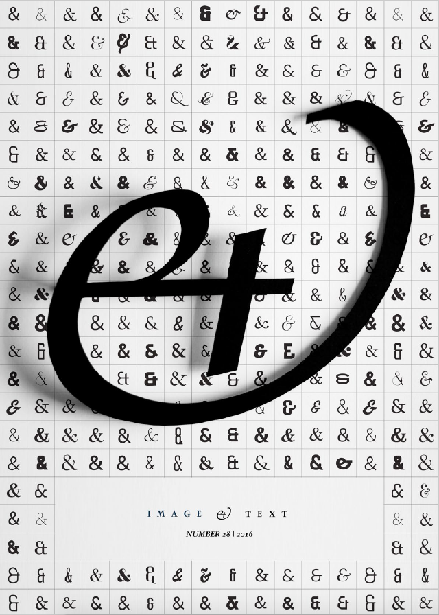
Letterforms1 exhibit a great many structural differences across a plethora of assorted typefaces. Opting for the elegance of Chronicle’s charming characters over a bolder Bebas brigade for example, suggests that the structural complexity of each typeface strikes a remarkably particular tone. In my view, these complexities embodied by the letterform are under-explored in design discourse2 (van Leeuwen 2005:138). I maintain that typography is largely viewed as inherently linguistic – as dependant on the rhetoric of language. Furthermore, I believe that the visual manifestation of type is really a visual manifestation of language, of thought – a “true art”. In my experience as a designer and design educator, I have observed that the majority of typographic exploration is limited to the semantic quality of type, where the appropriateness of letterforms – changes in their structural composition – are qualified by the degree to which they promote and elevate the conceptual genius of either language, illustration or other forms of parerga.3
In this article therefore, I explore and illustrate intricate communicative facets of (Latin) letterforms as communicative entities in their own right. In doing so, special attention is given to type as experiential form. By this, I refer to connotations that we derive from our reminiscent and intuitive perceptions of “abstract” letterform shapes.